Large Piece
- Thread starter Ace.
- Start date

You are using an out of date browser. It may not display this or other websites correctly.
You should upgrade or use an alternative browser.
You should upgrade or use an alternative browser.
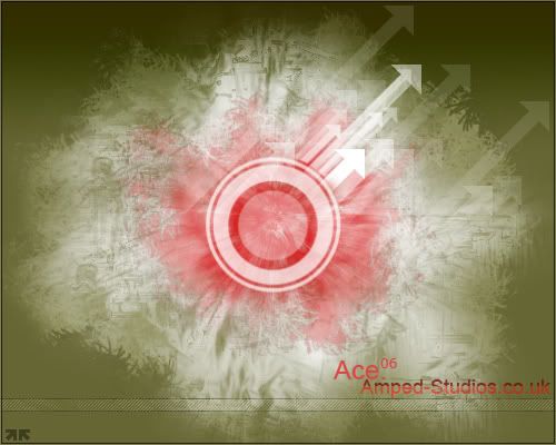
Yeh it's pretty nice, I dont like the text or the scanline bar along the bottom though. The red really brings it out in the center, good piece ") 7/10
7/10
7/10That style is so overused now. Easy style to master (like vector).
1/10 for originality, but the piece is quite good, colours and text are ****.
1/10 for originality, but the piece is quite good, colours and text are ****.
- Mar 5, 2005
- 1,085
- 2
- 145
same as everyone else really. i do like the piece, id give it 6.5/10.... but the red / green idea doesn't work for me, dont like the scanline. or 'amped-studios.co.uk' text. Ace text is alright.
nobody ever used to use it... until lyrical started using it in nearly every piece he made... so every1 followed him
cLu3LeSs said:nobody ever used to use it... until lyrical started using it in nearly every piece he made... so every1 followed him
Yup, somebody gotta be the leader around here, might aswell make it a good one.
Lyrical does a good job at graphics, so people try and do the same (nein rippage though).
/J34lY
lyrical is always the 1 who starts off the 'grapchics fashion' :P like marilyn manson started the 'freak fashion'
cLu3LeSs said:lyrical is always the 1 who starts off the 'grapchics fashion' :P like marilyn manson started the 'freak fashion'
Hehe, not always actually, besides this is getting too :topic:
/J34lY
its not off topic. we are discussing the design on this piece :P i think that on this piece the design is good... its just that too many people are using it and that makes it more crappy
cLu3LeSs said:its not off topic. we are discussing the design on this piece :P i think that on this piece the design is good... its just that too many people are using it and that makes it more crappy
i agree :P... it started as a great design but too many people use it.
/J34lY
JealY said:i agree :P... it started as a great design but too many people use it.
/J34lY
The same happened when ipix bought his style to the forum.
Make your own style or don't do anything at all imo (or atleast wait a month before you do it).
Perebble said:The same happened when ipix bought his style to the forum.
Make your own style or don't do anything at all imo (or atleast wait a month before you do it).
Yeah ipix brought the line ones didn't he?. the i <3 dataforce, ban me bigboy? or something like that =/
/J34lY
Colours are great, gives a hospital feel. Someone knows their complementary colours I see, the dull green really makes the red vivid. The text is hideous dude it looks like you put it in on paint.
For large pieces with detail and realism SMALL FONT with MINIMAL text is best. For large with abtract full on colour, LARGE fonts can work with placement. Don't float words EVER unless they are the main part of your piece!
For large pieces with detail and realism SMALL FONT with MINIMAL text is best. For large with abtract full on colour, LARGE fonts can work with placement. Don't float words EVER unless they are the main part of your piece!