Guildwars sig lal
- Thread starter EvilGoku
- Start date

You are using an out of date browser. It may not display this or other websites correctly.
You should upgrade or use an alternative browser.
You should upgrade or use an alternative browser.
Looks good, but both sides are a bit plain imo, maybe change the colours a bit, or add something, good job though!
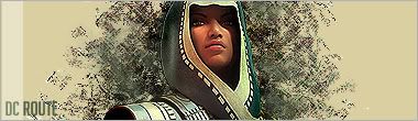
i rly like it bud the piccy of the monk stans out well.
but how about making the name horizontal down each side??
but how about making the name horizontal down each side??
its a Dervish mate , but still.(sorry to be a smart arse)
lol so it is -_- anyways it looks good to me
- Mar 5, 2005
- 1,085
- 2
- 145
- Nov 12, 2006
- 388
- 4
- 65
The fact that you can't design yourself and you clearly cannot observe something i don't care what you write reddragon.. in all your posts you don't say whats bad whats good so stfu and go troll somewhere else.
Tx, i love u.
Tx, i love u.
- Mar 5, 2005
- 1,085
- 2
- 145
- Nov 12, 2006
- 388
- 4
- 65
This is my thread? so go away
Tx i love you
Edit cant be assed reposting... your too hard for me buddy.. to hard.. please don't hurt me
Tx i love you
Edit cant be assed reposting... your too hard for me buddy.. to hard.. please don't hurt me
Last edited:
- Mar 5, 2005
- 1,085
- 2
- 145
- Oct 2, 2005
- 546
- 1
- 125
text too small, and i would change it color maybe, there r no many details in it, i would add something, and i dont know, its seems to me that 1 side is kinda empty.
6.5/10
6.5/10
- Mar 5, 2005
- 1,085
- 2
- 145
And yours Rules of course!
-.-
Sorry, its better than your -.-
- Mar 5, 2005
- 1,085
- 2
- 145
hahaha, yeah.
/RDX
Immature? Could of at least posted why it sucks etc. now shut up and leave it. thanks
")
- Mar 5, 2005
- 1,085
- 2
- 145
Immature? Could of at least posted why it sucks etc. now shut up and leave it. thanks
Shut up.
/RedDragonX