- Jul 26, 2007
- 1,818
- 18
- 145

 )
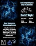
)The outine on the chunk of texts seems too "thick"?It has to look kinda catchey to make someone want to read it though sir simpson. Surley you know about selling your product market :P
Aye i think its ok im going to try smooth out that text abit not 100% sure how but maybe if i play around with the shadow settings ect.
Cheers
EDIT does this look any better?