Elektrik
- Thread starter SkyDragon
- Start date

You are using an out of date browser. It may not display this or other websites correctly.
You should upgrade or use an alternative browser.
You should upgrade or use an alternative browser.
ye looks ok shame about the poor effort in spelling eh.
I know it's spelt wrong you smack.
and no it's not based from any tutorial.
Thanks for comments
Steish.
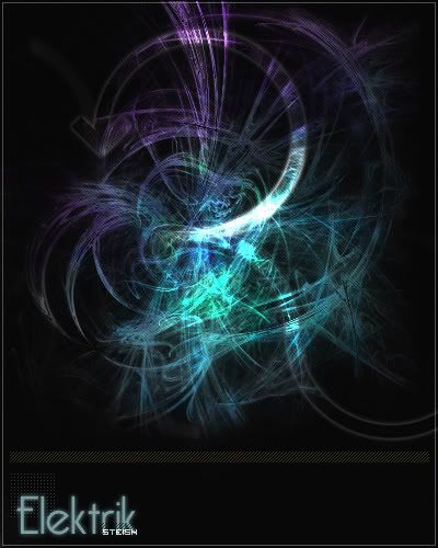
The colours are very nice together and stand out 100% spot on.
The dull bg actualy works in this piece as it shows the main part.
The text is nice and so are the 'lined boxes'.
Just a couple of things though:-
- Looks alot like a tut
- Looks like your trying to be like lyrical.
The dull bg actualy works in this piece as it shows the main part.
The text is nice and so are the 'lined boxes'.
Just a couple of things though:-
- Looks alot like a tut
- Looks like your trying to be like lyrical.
- Looks alot like a tut
- Looks like your trying to be like lyrical.
It isn't from a tutorial, never have and never will use those, Brewie/chu22 helped me out all I needed when I started.
My work is alot like Lyrical's and thats because I like his designs, theres nothing wrong with following someones work? Aslong as I'm not stealing it.
- Oct 17, 2003
- 412
- 1
- 115
It isn't from a tutorial, never have and never will use those, Brewie/chu22 helped me out all I needed when I started.
My work is alot like Lyrical's and thats because I like his designs, theres nothing wrong with following someones work? Aslong as I'm not stealing it.
Very true i like Lyrical's designs 2 and ur not stealing his work so im sure theres nothing wrong with doin similar designs :P i love this design its pretty damn good!.
9.5/10 tbh
The colours are very nice together and stand out 100% spot on.
The dull bg actualy works in this piece as it shows the main part.
The text is nice and so are the 'lined boxes'.
Just a couple of things though:-
- Looks alot like a tut
- Looks like your trying to be like lyrical.
Jesus christ how many people in this ****ing world do you think do similar designs ? TOO MANY.
- Nice work woot I like it. 8/10
- Mar 5, 2005
- 1,085
- 2
- 145
The colours are very nice together and stand out 100% spot on.
The dull bg actualy works in this piece as it shows the main part.
The text is nice and so are the 'lined boxes'.
Just a couple of things though:-
- Looks alot like a tut
- Looks like your trying to be like lyrical.
You need a slap
/RedDragonX
- Mar 5, 2005
- 1,085
- 2
- 145
Well, when somebody big enough comes along mate you point them to me, but for now, hush.
Shut up, your embarrasing yourself
I rest my case
nice work. i love the colours.. reminds me of the fractal brushes you can get..
8.5/10
and hated.... shut up you spoon..no one likes you
8.5/10
and hated.... shut up you spoon..no one likes you