Interface
- Thread starter Leng
- Start date

You are using an out of date browser. It may not display this or other websites correctly.
You should upgrade or use an alternative browser.
You should upgrade or use an alternative browser.


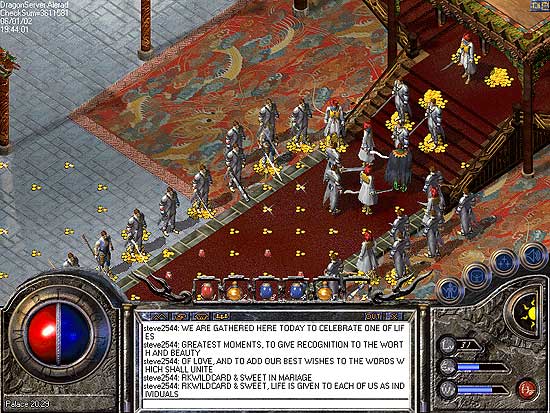
Very nice, won't the box in the middle need to be white, due to the texts natural background being white?
With few tweaks, could be very nice, not choppy nice smooth edges etc.. and doesn't look too painful on the eyes")
With few tweaks, could be very nice, not choppy nice smooth edges etc.. and doesn't look too painful on the eyes
- Jun 9, 2009
- 161
- 0
- 42
- May 2, 2009
- 74
- 0
- 33
Very nice, won't the box in the middle need to be white, due to the texts natural background being white?
With few tweaks, could be very nice, not choppy nice smooth edges etc.. and doesn't look too painful on the eyes
On some of my interfaces I do keep it white but this was done grey because it looked better with the server logo I was going to fade onto it.
The white text boxes don't look to bad though and actually stand out better.
I'm still working on a way to try and remove the white background from the text for a different interface.
have to agreei hate it tbh
looks like USAs interface
looks like something done in paint
im sure ur gonna say im sayin this cause u think i dislike u but im not, i just odnt rly like it
- Jul 26, 2007
- 1,818
- 18
- 145
Looks abit tinny, Although i do admire your efforts working on the interface, Not as many people do them now, As stated the ring round the hp/mp bar needs darkening down abit sticks out too much also the picture on the right needs taking out and perhaps use the same as u used on the background the other side. Also theres quite alot of work to do with all the other bits and bobs which need changing too to match this.
Nice work.
8/10
Nice work.
8/10
- May 2, 2009
- 74
- 0
- 33
have to agree
looks like USAs interface
looks like something done in paint
im sure ur gonna say im sayin this cause u think i dislike u but im not, i just odnt rly like it
LoL would not expect any other comment but the one you gave to be honest Ben.
Thanks to the others for the positive comments. It is not to my taste and can be greatly improved, but I made it for someone else and that's pretty much how they asked for it to be.
looks like USAs interface
Because it's grey/silver? Mmm, very constructive.
Bon said:looks like something done in paint
Go on then.
- May 2, 2009
- 74
- 0
- 33
just noticed the gay face on the right what's that all about?
It's you m8, I thought you would like it.
I cut and paste your profile picture from GAYDAR :wink:
- May 2, 2009
- 74
- 0
- 33
not really, ill give my honesty opinion, which is i think its ****
it dont look like a mir interface.. dont cry over it.. by it looks like usa interface i meant it looks crap and unprofessional
Nobody is crying Ben.
Thanks for your negative comments again but I don't really care as I did not post it to get judged on, but to see if it was any good to anyone. :wink:
Now you get back to pulling the wings off flies and shouting insults at school kids from your bedroom window.
When I get some time I will post a few of my other interfaces and you can big yourself up by putting them down and make yourself feel better :thumbup2: