Snake sig - Brawl
- Thread starter Joopers*
- Start date
You are using an out of date browser. It may not display this or other websites correctly.
You should upgrade or use an alternative browser.
You should upgrade or use an alternative browser.
- Nov 12, 2006
- 388
- 4
- 65
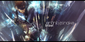
Edit.. Hmm it looks ok but the you've sharpened the image too much the font is nice but the whole sharpness and randomness of background lets it down.
The border looks nice.
But generally the render does not blend well enough with your background as it looks quite scruffy around the image. Seems like it was placed there for no reason. The colour choice is nice but it's let down by how you've sharpened them and the image.
Overall the render blending let's the peice down as everything else would work nicely if it was placed /blended better.
Text is placed nicely nothing to say about that.
Tx.
Last edited:
I was worried about those lil dots about him, i sharpened it too much at the beginning, anyway cheers for feedback.
its kinda cool, it looks like his like falling or getting blown Up into the air , and its distorting his arms or somthing.
i like but the actual snake image looks pretty crummy.
Sharpned to much.
but still nice 9/10
i like but the actual snake image looks pretty crummy.
Sharpned to much.
but still nice 9/10
I made a new version i'll post in the morning i really cba at the mo..
Basically most of the lil dots have gone/faded
Basically most of the lil dots have gone/faded