Bring the Bass

w00t84

Big Dick
Golden Oldie
May 25, 2004
1,688
8
144
Newcastle!
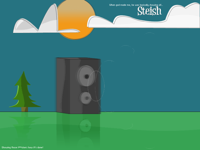
My latest design, of course, fully designed by me no googled images or anything.. ratings and comments all appreciated, good and bad.

SteishIII.gif


Cheerio.

.Steish
 
Last edited:

Xanan

LOMCN Veteran
Veteran
Loyal Member
Jan 5, 2006
1,203
10
144
Its simple, but still looks professional.

You have a thumbs up from me.
 

Far

tsniffer
Staff member
Developer
May 19, 2003
20,179
30
2,783
540
i like it. but the speaker is too blurred. 8.1/10
 

w00t84

Big Dick
Golden Oldie
May 25, 2004
1,688
8
144
Newcastle!
Yeah my original one wasn't a blurred speaker, was a smooth one, but I figured the blur gave it a focal point and made the main point of the design stand out.

I was aiming for a professional but slightly 'childish' look, guess I've pulled it off :)

Cheers for comments

Steish
 

Xander

Pantie Sniffer!
Developer
Oct 20, 2003
2,737
55
295
Sheffield
Don't think the box should be blurred just the actual ring of the speakers but nice work you ****.
 

Joopers*

LOMCN Veteran
Veteran
May 10, 2006
693
1
125
Behind you
Scrap everything but the clouds and the sun, it could make a badass layout.

But, on the thing..Make the speaker darker to stand out more.
 

w00t84

Big Dick
Golden Oldie
May 25, 2004
1,688
8
144
Newcastle!
Layout for what?

I've played around with the light and dark and nothing came of it :eek: Well.. I say nothing came of it, something did, I just didn't like it.

.Steish
 

TxGraphicz

LOMCN Veteran
Veteran
Loyal Member
Nov 12, 2006
388
4
65
Scrap the whole idea and put a 1 pixel black dot in the centre of the piece, then you'll have a wicked layout.
 

FUTURA

Golden Oldie
Golden Oldie
Jun 25, 2003
1,517
16
195
DXB
its cack. but amazing potential. keep workin at it pal, you'll be flippin sick in no time. (its cack because it looks like a 10 yr old drew it before people start cryin 'dont jus thay its cack mayte yoo gotta giv a reezon'. ******s the lot of you